I need you to design a logo.
This logo will represent your team’s newest publishing imprint. It will act as an emblem for the countless hours you spend on the countless products you make. It will be the final piece of a puzzle years in the making.
The logo should look both “of the moment” and timeless. For most uses, it will be no bigger than a button—but it will still need to be legible from several feet away. It should work as any color on any color.
This logo will be the newest logo for a company synonymous with excellent graphic design. You will see it almost every day for the rest of your professional life. Over the course of its life, this logo will make its way across the globe. Your team will use it on books, social media platforms, tote bags, soft enamel pins, email signatures. The list goes on.
Handfuls of people with handfuls of opinions (almost none of whom come from art backgrounds) will need to approve it—including your boss, your boss’s boss, and your boss’s boss’s boss (who just happens to be the president of your company). Once approved, the legal department will check its authenticity.
Sketches are due in a couple of weeks. Art is due in a couple of months.
Go.
NAMING AN IMPRINT . . .
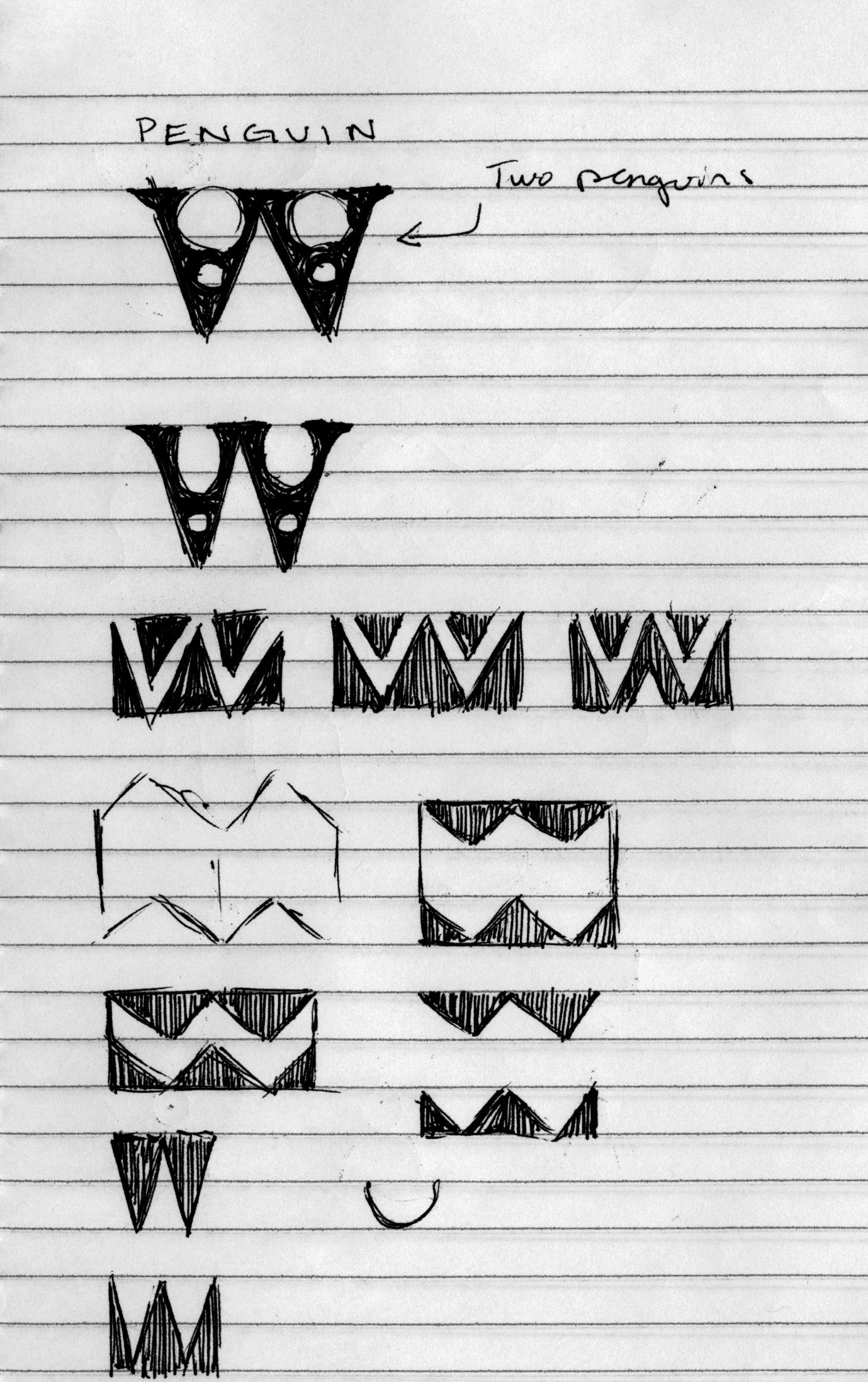
When I was at Penguin, I was asked to design an imprint logo. Here is how it went down:
On the publisher’s desk lay three scraps of paper, each with a different name scribbled on it. The publisher, the associate publisher, and I were staring intently at each piece of paper, imagining our future. This was it. After months of discussion and reflection and maybe a little consternation, we had finally whittled down our new imprint name to three choices.
Earlier in the year, the publisher asked our group of roughly thirty people from various departments to submit names for the new imprint. The response was what you would imagine from creative book lovers: we could have started a new major publishing company with several dozen imprints, all with better names than many current imprints. But we only needed one name. And that name was on his desk. “What do you think of this one?” he asked. It read:
We sat for a few quiet moments, letting the name settle in our minds. We processed the myriad scenarios in which we would use it. I work at Penguin Workshop, I imagined saying to a fictitious colleague. I liked it. It suggested quality, experimentation, and good work. It felt right.
The three of us agreed: We had found the name of our new flagship imprint. Now we needed a logo.
A COLOPHON iS . . .
An imprint is a subset of a publishing house. It is a smaller publisher operating underneath the umbrella of a parent company. It is a city in a state. A sibling in a family. Like cities and siblings, each imprint has its own identity, goals, history, future.
At Penguin Young Readers, there are nearly twenty different imprints. Most of them have their own logo (or colophon). This logo acts as an entry point; a small but important stamp imbued with the personality and reputation of the authors, illustrators, editors, designers, copy editors—all the people who comprise the imprint.
When I was asked to design a logo for Penguin Workshop, I responded with, “Of course!” It was a rare honor. A dream assignment for a designer. But as I walked back to my office, my anxiety levels rose. What am I going to do? I thought. How is this going to look? Where do I even start?
PEN. MEET PAPER.
I wasn’t sure if the lack of an idea was due to my anxiety or fed into my anxiety. Probably both. Either way, nothing was coming to me. There was no obvious answer. The solutions were simultaneously infinite and nonexistent. I felt like I was driving without a map to a place I’d never been, yet still expected to be on time.
Meanwhile, I kept an eye out for anything that might lead me down the right path. I collected reference from old books, antique stores, and the Penguin backlist.
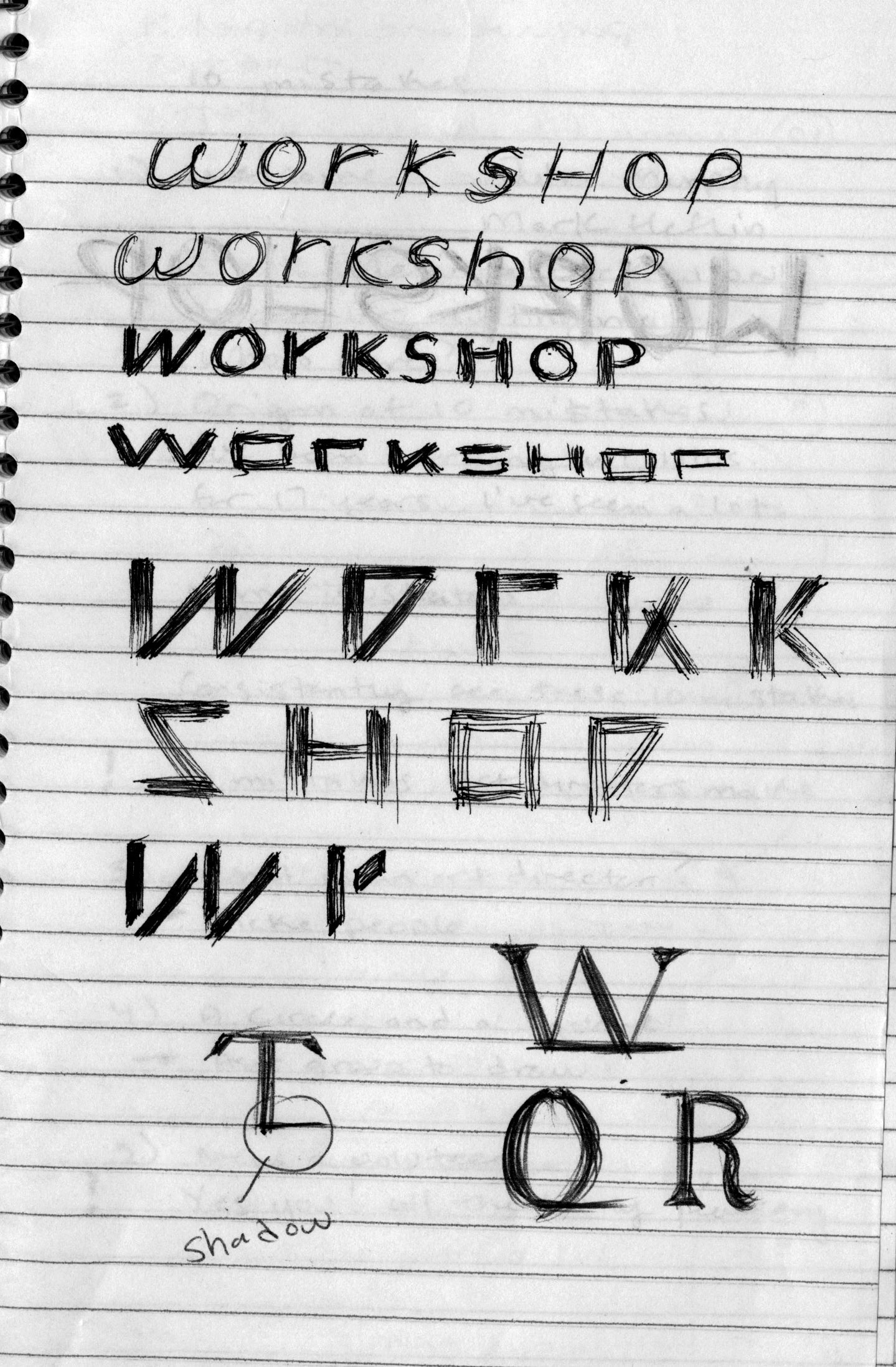
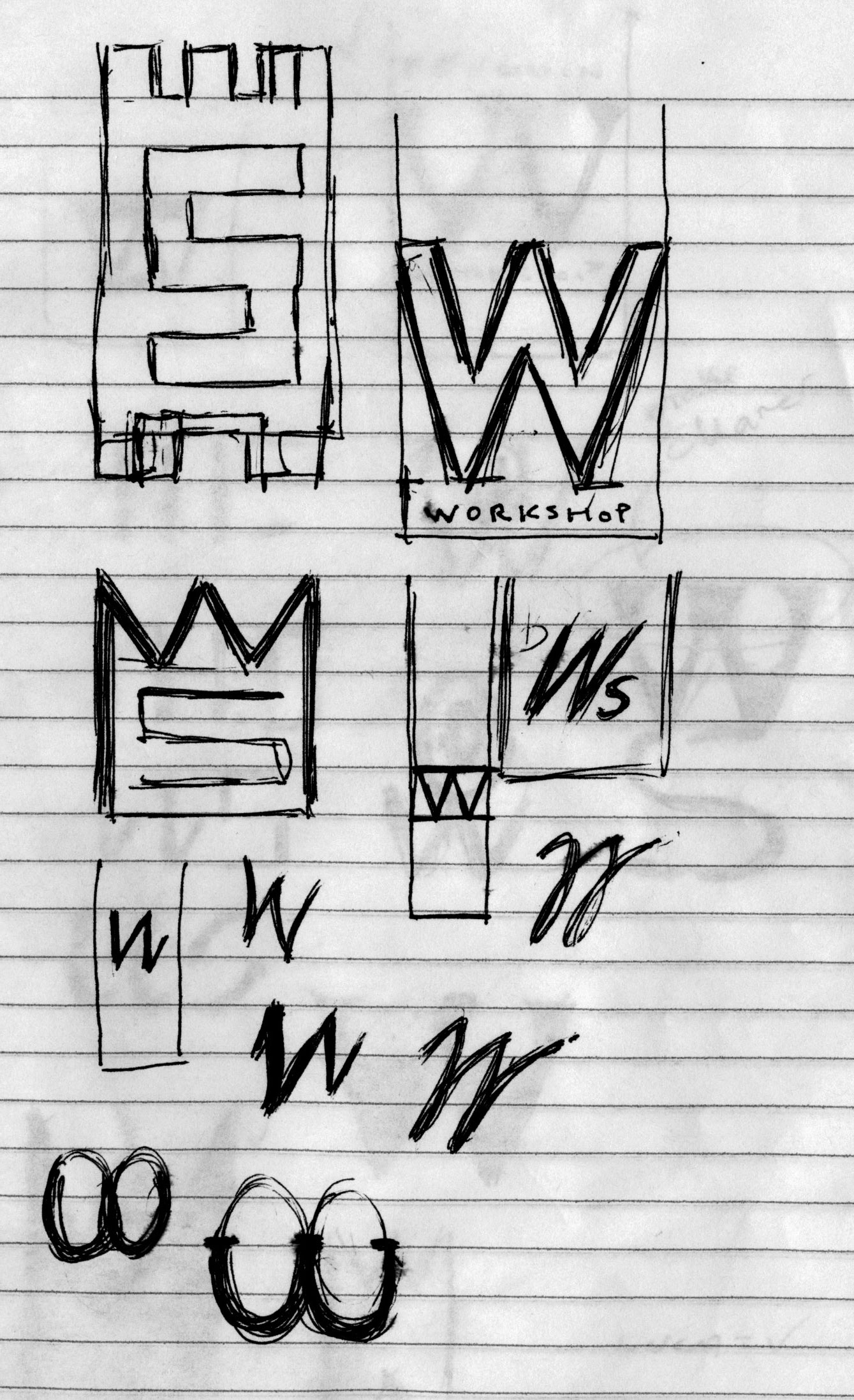
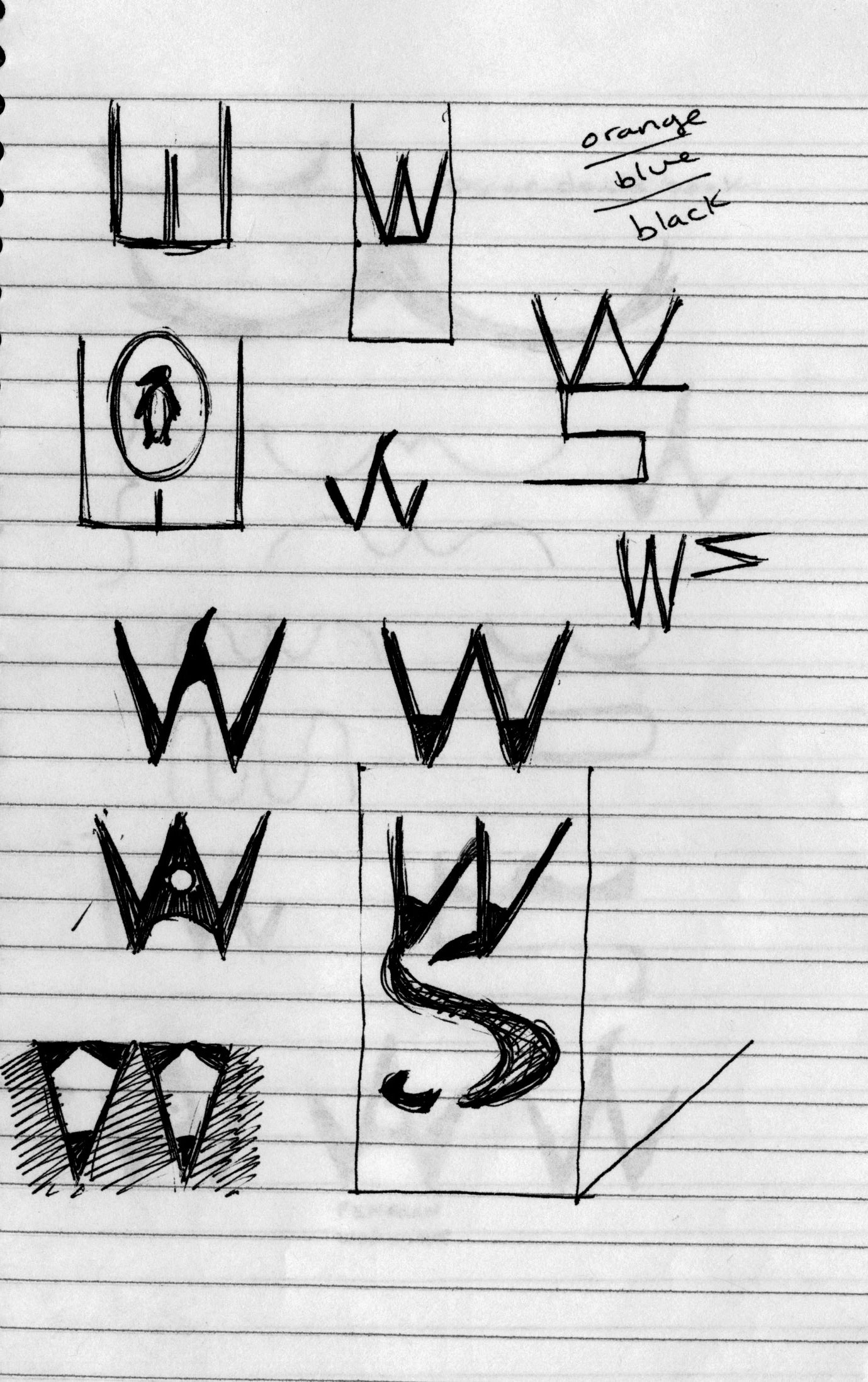
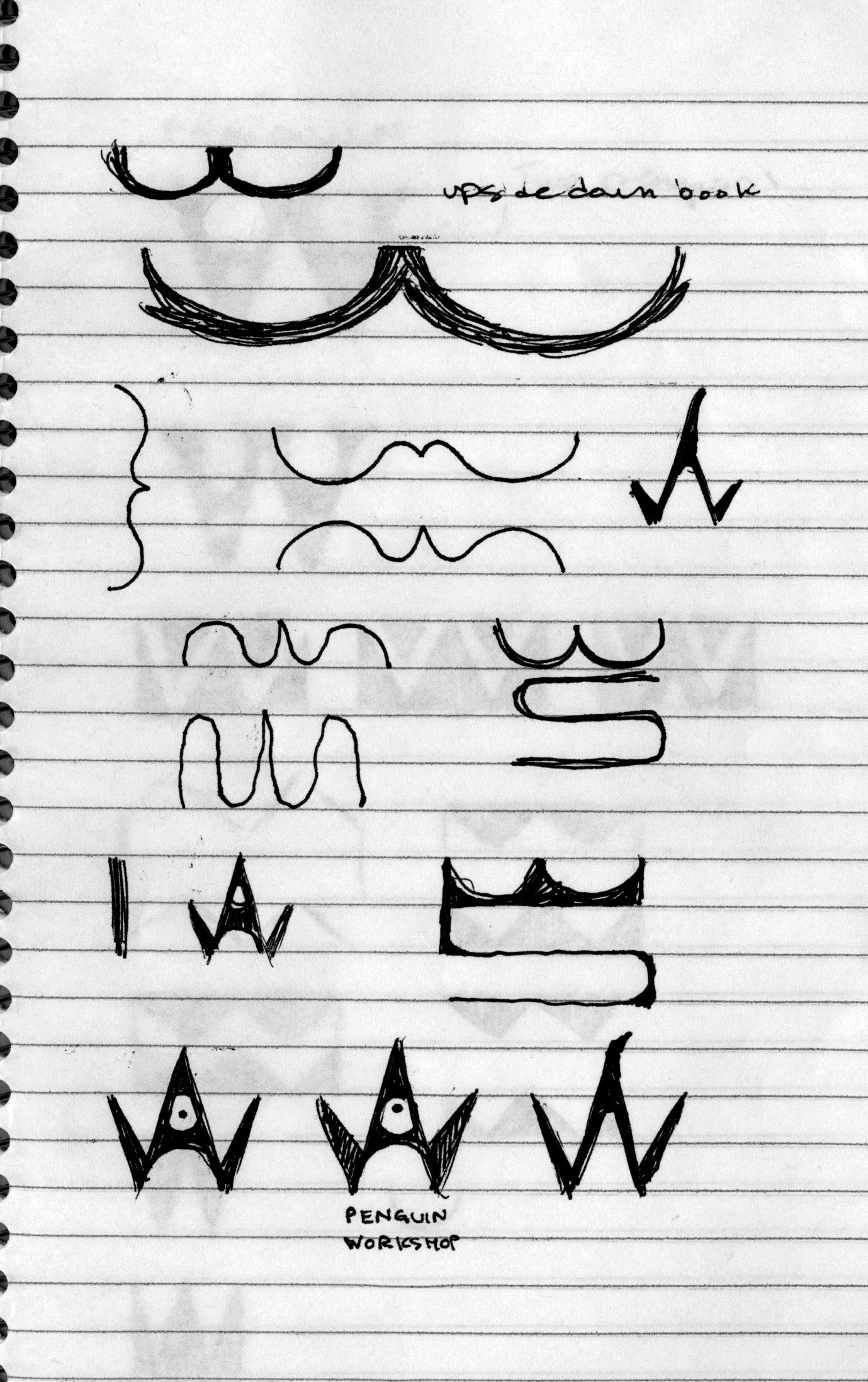
Finally, I managed to place a pen tip on a piece of paper, taking that very challenging first step: starting.
The moment the pen drew that first line, my inner critic reluctantly gave way to my subconscious (or muse, or whatever you want to call it). Ideas were starting to form. They weren’t winners, but they were certainly better than nothing.
ALLEN, EDWARD, JOAN, AND JAN
It was not lost on me that this logo was going to be a Penguin logo. I felt it was important to understand where I was coming from to get a sense of where I should be going.
The founder of Penguin, Allen Lane, wanted to publish a series of inexpensive—yet high-quality—paperback fiction and nonfiction. When he said he wanted a symbol that was “dignified but flippant,” his secretary, Joan Coles, suggested a penguin. It was now up to Edward Young to design a logo. As Young later said, “It was the obvious answer, a stroke of genius. I went straight off to the zoo to spend the rest of the day drawing penguins in every pose.”
In 1949, at Lane’s request, the logo was revised by German designer Jan Tschichold. His drawing was cleaner, with a stronger balance between thick and thin lines. It was later tweaked in 2003 by Pentagram’s Angus Hyland. Tschichold also perfected the Penguin Classics cover design: using a balanced composition and timeless fonts (like Gill Sans and Bembo) to improve upon the iconic tripartite solution.
Through my research and process, I noted key words: balance, thick/thin lines, simplicity. I still had no idea where I was going, but something was working itself out. Good thing, too, because it was time to show my sketches to the publisher.
YES? NO.
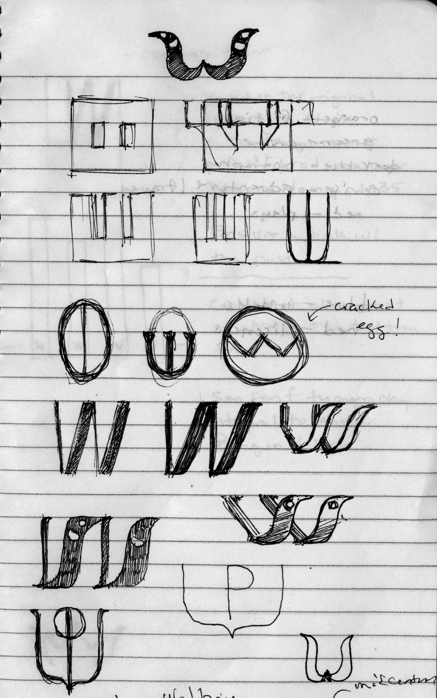
As the publisher flipped through my sketchbook, he shared rapid-fire responses: “That’s nice. Not that one.” One idea especially caught his eye: two pencils. “This is interesting . . .”
Funny. This drawing was a throwaway. It felt contrived when I thought of it, but I put it down on paper just to get it out of my head.
With one round of sketches, we managed to cut our choices from infinite to a handful. That was the good news. The bad news was that our announcement was fast approaching, and we didn’t have a logo yet.
“WE’RE NOT A HOTEL.”
Using my sketches as a jumping-off point, I moved to the computer. The mission: To clean up and flesh out some of the better ideas in the hope of bringing the overall branding into focus. This stage was the equivalent of capturing the gesture in figure drawing. Refinement of the shapes would come later.
From left to right, top to bottom: 1. Simple. 2. “Moving forward”. 3. Penguins together. 4. Homage to Jan. 5. Simple. 6. Eh. 7. A penguin holding a book. 8. A penguin with its fins up—forming a W.
The publisher felt I overshot the landing, though, ending up with logos for hotels or adult imprints. They were missing a youthful touch.
Time was ticking, and I was minimally closer to a solution.
OR?!
Two pencils . . . two pencils . . . Something about that visual kept tugging at me. I didn’t like the idea of literally showing pencils. It felt too illustrative. And I worried that a representationally illustrated logo would clash stylistically with the illustrations in our books. Still . . . the tugging persisted.
Using a few classic typefaces like Memphis, Futura, and others, I hacked away at the “two pencil” concept. It was either going to work, or I was going to flush the idea out of my system.
Meanwhile, I wondered, What if the logo wasn’t a play on the W? What if it was . . .
A baby penguin?!
A “spark” of creativity?! And we change the name to Spark?!
Zoomed-in pixels?! And we change the name to Chroma?!
For a day, the publisher and I were convinced that the baby penguin was our new logo. But the excitement quickly faded, and I got back to the two pencils.
THE W
A good logo clearly communicates. It’s utilitarian. It should work on a billboard and a matchbook. It should command the absolute minimal amount of comprehension time. I’m not saying it needs to be dull. Logos can be both unassuming and sly. Look at the FedEx logo. Do you see the arrow? Look between the E and the X. Now you do.
The two pencils didn’t have an auspicious beginning, but after countless drawings—both on paper and screen—I finally figured it out.
Instead of Gill Sans or the like, I used a reverse-contrast font, tweaking its letter forms to build the W and the longer logo. Reverse contrast is a style of typeface in which the contrast between the thick and thin strokes is reversed (obviously). This style has more than a toe dipped in classic concepts, but with a unique and unexpected personality. Class with an unexpected twist? Yeah, that sums up the Workshop books nicely.
Why two pencils? Publishing is a collaborative industry. A children’s book is in essence an object of art comprised of words and pictures. One pencil represents the author. The other represents the illustrator. Together, they draw a unified line.
The W colophon is a trademark of Penguin Random House LLC.
Months after we first stared at “Penguin Workshop” scribbled on a piece of paper, our logo was finalized and approved by all. It showed up in Publishers Weekly. It was submitted to the design, marketing, and publicity teams. We made swag. And now you can see it on our books.
Time will tell if this logo becomes a mainstay. One thing is certain: I can’t wait for the next time someone says to me, “I need you to design a logo . . .”


